Cities Alliances
Making Knowledge Accessible - Rethinking the Knowledge Library
Challenge:
Cities Alliances (hosted by UNOPS) is a global partnership fighting urban poverty and supporting cities to deliver sustainable development. Its knowledge library provides access to resources on urban challenges around the world. Users can search reports, articles, and events regarding new developments, policies, or solutions.
Cities Alliances set a goal to relaunch this knowledge library with increased accessibility and improved filtering options for search results. Users of the existing library had difficulty finding it, using the navigation, and staying within the flow of their research.
Cities Alliances set a goal to relaunch this knowledge library with increased accessibility and improved filtering options for search results. Users of the existing library had difficulty finding it, using the navigation, and staying within the flow of their research.
Project Category:

Approach
I began the project by doing discovery work with stakeholders including Cities Alliance’s staff, members, and partners. The first step was semi-structured interviews and surveys. I gathered valuable feedback about the existing knowledge library, its user experience, and potential areas of improvement.
Through the surveys, I gained a better understanding of the most relevant topics. I identified five main issues, and two stood out regarding the user experience:
There is no clear distinction between the website and the library due to its presentation on the home page. Users overlooked it, or could not easily locate links to the library. Further, featured articles and other information that could intuitively lead to the library did not, causing confusion. The library navigation takes users easily out of the library: clicking on some products redirects the user outside of the library into the programmes page or into the news section. Once the user selects a particular theme, there is not an overview of the theme content and offer.
The tagging system used is inconsistent between the library and website which also causes confusion. Some products and multimedia clusters appear as separate products to the knowledge library, which creates a sort of ‘competition’ instead of a cluster of files. The search function is also limited since many documents and knowledge products are not properly tagged yet. Finally, keywords/tags are not part of the library filters.
Result
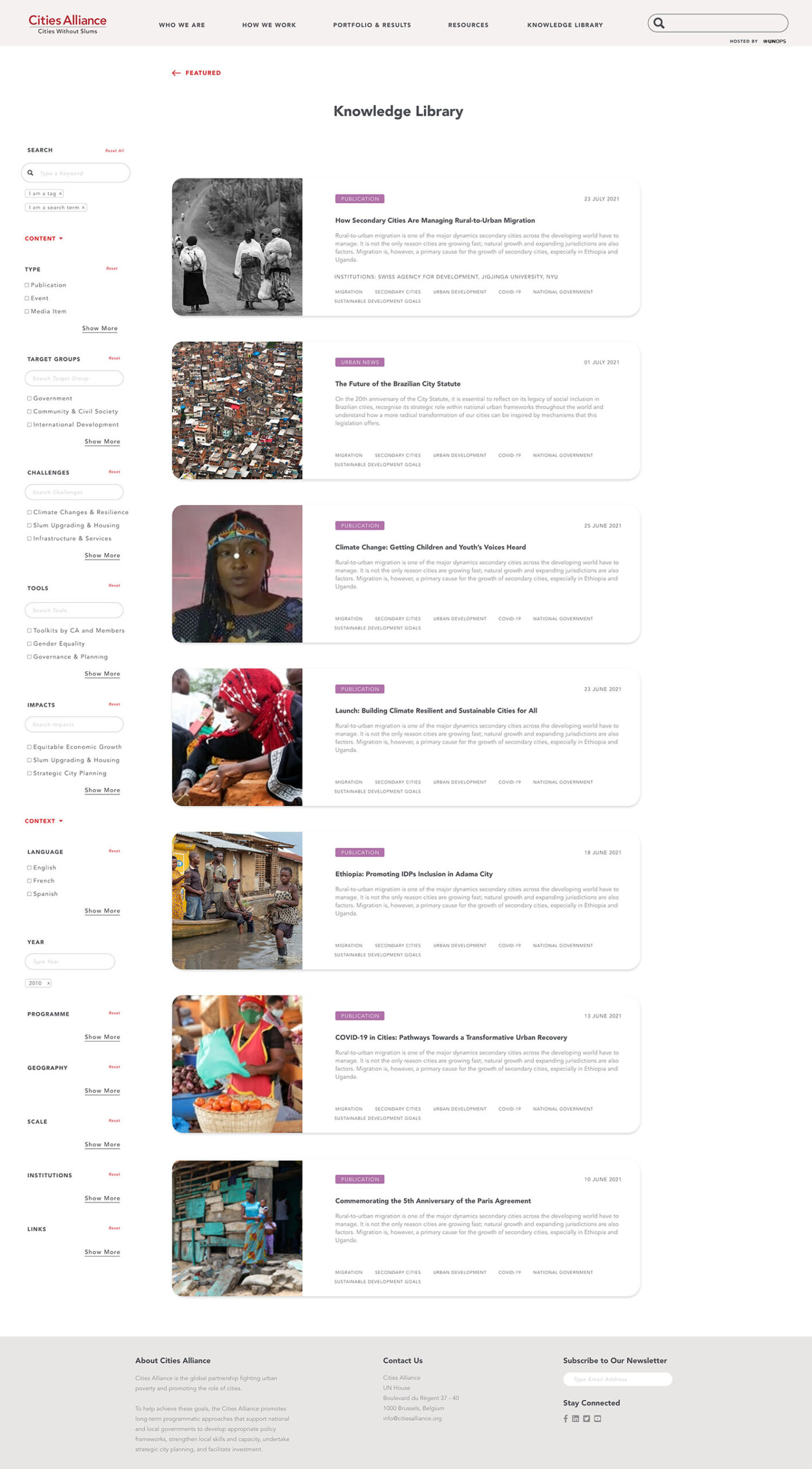
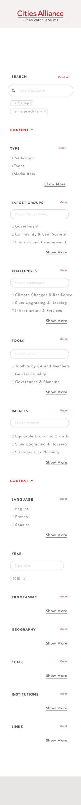
Revising the taxonomy proved to be the single most important element in the restructuring of the library. The knowledge library had to be more dominant on the website, so I moved it near the top of the home page. When navigating to the library, you now go to a library landing page, not a search page.
The second major improvement was adding to the search and filtering options. Users now have more options, giving them more control for narrowing down what they are looking for. The former simple search bar with limited options is now a robust search “section” with controls and guidance centralized on the left side of the page. The results are shown as soon as something is selected, giving the user a better overview of the contents.
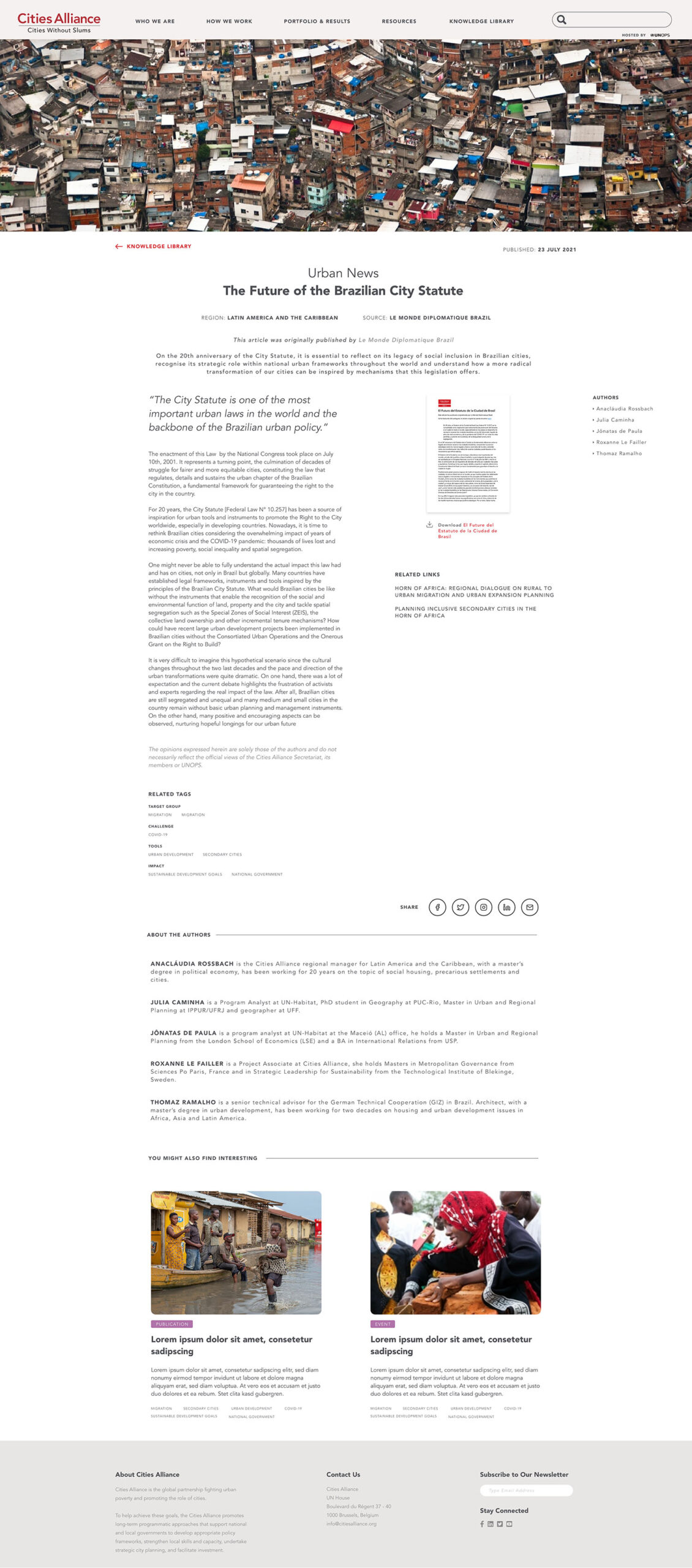
Lastly the “blog” page itself has been reorganized to highlight the most important information at the top and external links have been grouped on the right side. This way the user is aware that they will be redirected to an external website.
In addition to architectural changes, I recommended updating the visual design of the library as well. The primary color was originally red, which is an alarming color. Red is typically reserved for emphasis and errors. Looking at their branding guidelines I discovered that there is a broad color palette available. I chose a more neutral primary color within their brand guidelines and used red only as a highlight color. I have also discussed other visual elements with the client such as image sizes used for their website. Primary visual elements have not been optimized for the web, causing lags and slow load times. Improving these items could lead to improved search engine results as well as a better user experience.
The second major improvement was adding to the search and filtering options. Users now have more options, giving them more control for narrowing down what they are looking for. The former simple search bar with limited options is now a robust search “section” with controls and guidance centralized on the left side of the page. The results are shown as soon as something is selected, giving the user a better overview of the contents.
Lastly the “blog” page itself has been reorganized to highlight the most important information at the top and external links have been grouped on the right side. This way the user is aware that they will be redirected to an external website.
In addition to architectural changes, I recommended updating the visual design of the library as well. The primary color was originally red, which is an alarming color. Red is typically reserved for emphasis and errors. Looking at their branding guidelines I discovered that there is a broad color palette available. I chose a more neutral primary color within their brand guidelines and used red only as a highlight color. I have also discussed other visual elements with the client such as image sizes used for their website. Primary visual elements have not been optimized for the web, causing lags and slow load times. Improving these items could lead to improved search engine results as well as a better user experience.
User Impact
The website is still being developed and migrated. The user impact will be a more user-friendly website with an improved search function making knowledge easily accessible.


Can’t get enough?
My mission is to make information resources available, appealing and accessible for the user, while utilizing a creative problem-solving approach. Want to know more about this project? Let’s talk!