H.A.R.D.* App
Disaster Risk Management Made Simple
Challenge:
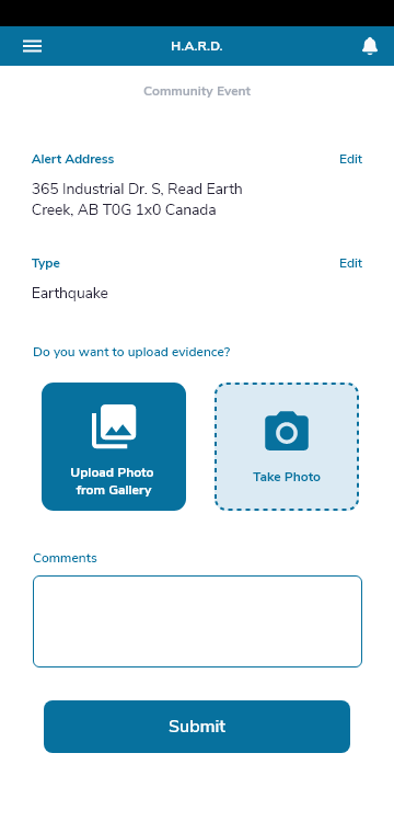
CIUrb determined that a mobile version of their existing disaster risk management web application was needed to provide their governmental users with faster, easier communication with citizens. The web app is being used in several countries to inform citizens of information in emergency situations. The mobile app adds the ability for citizens to actively participate in emergency management by reporting issues as well.
Project Category:
Approach
I took over the user strategy and design for the H.A.R.D. Android App after the previous designer left the project. My role is to pick up where they left off and continue leading the user experience efforts for the mobile version.
I began by reviewing all existing documentation to get a better understanding of the decisions that have been made and the current state of the product. Technology and resources do not allow for the entire web app to be included in the mobile version, so the core design tasks involve identifying which key functions can and should be included, and which can or must be slated for future updates. These decisions will be influenced heavily by the fact that the app’s primary users often live and work in countries where network stability is questionable and their tech-savviness varies greatly.
Once I had reviewed the current state, I suggested improvements for the copy and the information architecture of the app. I discussed my findings with the project manager and decided on the changes. I was also given access to the test app to get a "feel" for the product. Further, I asked for a meeting with the development team to discuss some functions and their implementation.
Result
The H.A.R.D. Android app was launched in August of 2021. It is currently being used in one city in Brasil and there are negotiations with other cities to implement it.
I identified the core functions for inclusion in the app by reviewing existing data on web application use. My research showed that the following two functions were most used.
- Government entities informing citizens of events
- Citizens actively reporting events to assist their community
Next, I engaged assistance to interview current users in order to uncover additional features that could be added to increase the value of the mobile app. The users spoke Portuguese so a translator was needed. Users reported needing both a central, dedicated emergency contact and a way to directly engage with government officials. I added a contact list feature in the app similar to a telephone book feature.
User Impact
The existing web platform is being used by city officials to alert or inform citizens about upcoming crises and events. The mobile version will increase accessibility to information in a timely fashion while enabling citizens to more actively participate in the reporting and managing of emergency situations. The app is currently in use in one city, and plans to measure the communication improvements, as well as trust with governments, are in place to assess the impact once more cities begin using the mobile app.
*has been renamed to "ACCTION"
*has been renamed to "ACCTION"
Can’t get enough?
My mission is to make information resources available, appealing and accessible for the user, while utilizing a creative problem-solving approach. Want to know more about this project? Let’s talk!


